Make CD Covers
Making Your Own CD Covers That Look Professional
Before you even think about fonts or photos, a little prep work will save you a world of headaches. Nailing the technical specs from the get-go is the difference between a passion project and a professional release. Getting these details wrong leads to blurry images, wonky colors, and artwork that just doesn’t fit the case.
Think of this as laying the foundation for your design. Just like a house needs a solid blueprint, your CD cover needs a precise technical setup to support your creative vision. Let’s walk through the non-negotiables.
Your Blueprint for a Flawless CD Cover
Mastering Dimensions for a Perfect Fit
First things first: set your document to the exact dimensions of your chosen CD packaging. This is the most critical step. Every case type, from the classic jewel case to a modern digipak, has unique measurements for its cover, tray card, and booklet. Starting with the wrong size is a recipe for disaster, forcing you to stretch or crop your beautiful artwork later—and wrecking its quality in the process.
For instance, a standard jewel case front insert is a perfect square, but the tray card behind the CD has perforated “spines” that you have to account for in the design.
Pro Tip: Always download a professional template from your printer. We offer a full range of dielines at Mixtape Duplication that come with pre-set dimensions, bleed lines, and safe zones. It completely removes the guesswork.
The whole idea of making your own CD covers isn’t new; it exploded in the late 1990s as home computers and printers became household items. As U.S. CD sales jumped from around 10 million in 1990 to over 500 million annually by the decade’s end, a huge market for custom art emerged. By 2000, it’s estimated that 30% to 40% of independent releases featured DIY covers—a testament to the timeless appeal of personalized physical media. You can dive deeper into the history of album art on DesignRush.
To help you keep track, here’s a quick reference guide for some of the most common packaging dimensions you’ll encounter.
Standard CD Packaging Dimensions Guide
| Packaging Type | Front Cover (W x H) | Tray Card (W x H) | Booklet Panel (W x H) |
|---|---|---|---|
| Jewel Case | 4.75″ x 4.75″ | 5.9″ x 4.625″ | 4.75″ x 4.75″ |
| Slim Jewel Case | 4.75″ x 4.75″ | N/A | 4.75″ x 4.75″ |
| CD Sleeve/Jacket | 5″ x 5″ | N/A | N/A |
| 4-Panel Digipak | 5.5″ x 5″ (per panel) | N/A | N/A |
Always double-check these against the template provided by your duplication service, as small variations can exist.
Color Mode and Resolution Essentials
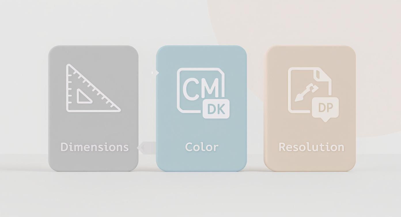
Next up are two technical settings that have a massive impact on your final print quality: color mode and resolution.
- Color Mode (CMYK vs. RGB): Your computer screen creates color using light (Red, Green, Blue – RGB), but printers use ink (Cyan, Magenta, Yellow, Black – CMYK). If you design in RGB, the final printed colors can look dull or completely different. Always set your design software—whether it’s Adobe Photoshop or a free alternative—to CMYK right from the start. This gives you a much more accurate preview of how the colors will look on paper.
- Resolution (DPI): Resolution is measured in Dots Per Inch (DPI). For crisp, professional-looking print, the industry standard is 300 DPI. Graphics pulled from the web are often only 72 DPI, which looks fine on a screen but will be a blurry, pixelated mess when printed. Make sure your entire document and any images you place into it are set to 300 DPI.
Finally, you absolutely must add a bleed. This is a small buffer zone—an extra 1/8th inch (0.125″)—of your background design that extends beyond the final trim lines on all sides. Industrial cutting machines aren’t always 100% precise, and this bleed ensures you won’t get any ugly white slivers along the edges of your finished cover. Forgetting the bleed is probably the most common (and easily avoidable) amateur mistake we see.
Choosing Your Creative Toolkit
Picking the right design software is your first big creative step, and it sets the tone for your entire project. The tool you choose can feel like a natural extension of your ideas or a constant technical roadblock. It’s not just about what the software can do—it’s about finding a program that vibes with your skill level, budget, and the specific artwork you have in mind.
Your creative toolkit can range from the big industry players to some seriously impressive free options. Let’s walk through the most popular choices to help you find the perfect match.
The Professional Powerhouses: Adobe Photoshop and Illustrator
When you see a stunning, professionally designed CD cover, there’s a good chance it was made with an Adobe program. Adobe Photoshop and Illustrator are the undisputed champs of the design world, but they’re built for very different jobs.
Adobe Photoshop is your go-to for anything photo-based. If your cover art hinges on a band photo, a gritty collage, or any kind of raster image, Photoshop is where the magic happens. It’s designed for editing pixels, letting you blend images seamlessly, apply complex filters, and create rich, detailed visuals. For an album with a moody, atmospheric photograph, Photoshop is the perfect tool to nail that vibe.
Adobe Illustrator, on the other hand, is a vector-based program. This means it uses math to create graphics that can be scaled up to the size of a billboard without losing an ounce of quality. If your design is all about logos, custom typography, clean lines, or graphic illustrations, Illustrator is the clear winner. The crisp, sharp edges it produces are exactly what you want for professional printing.
So, how do you decide which one to use?
- Go with Photoshop if: Your design is built around photography, textures, or intricate image blending. Think of a high-contrast band photo on a rock album cover.
- Go with Illustrator if: Your artwork is made of logos, geometric shapes, icons, or stylized text. A minimalist electronic album with a clean, symbolic logo is a classic Illustrator project.
Honestly, a lot of pros use both. They might design a logo in Illustrator and then pull it into Photoshop to merge it with photos and textures. While both require a subscription, their powerful features—especially the critical tools for managing CMYK color and bleed—make them the best bet for truly professional print results.
Capable and Cost-Free Alternatives
Not everyone has the budget for an Adobe subscription, especially if you’re an independent artist funding your own project. The good news? Free software has come a long way. There are several powerful options that can get the job done, as long as you know their quirks.
GIMP (GNU Image Manipulation Program) is often called the “free Photoshop.” It’s an open-source raster editor with a surprisingly deep toolbox for photo editing and composition. If your project is all about manipulating images, GIMP is a fantastic, no-cost alternative. The only catch is that its CMYK support can be a bit clunky, sometimes requiring plugins or extra steps to get your colors ready for print.
A common pitfall with free software is forgetting about print-specific settings. Neglecting to convert your design to a CMYK color profile is one of the fastest ways to get a final printed product with dull, disappointing colors. Always double-check this before you export.
Canva has exploded in popularity thanks to its incredibly user-friendly, browser-based interface. It’s a dream for beginners, making layout design a simple drag-and-drop process with tons of templates. You can absolutely design a great-looking CD cover in Canva. The main thing to watch out for is setting up your document correctly. You have to manually set your dimensions, add bleed, and make sure you export as a “PDF Print” file to get the highest quality output. It’s perfect for simple, graphic-heavy designs but might feel a little restrictive for complex photo work.
Making the Final Decision
At the end of the day, the best tool is the one that lets you bring your vision to life without fighting the software every step of the way.
Here’s a quick breakdown to help you choose:
| Software | Best For | Price | Key Consideration |
|---|---|---|---|
| Adobe Photoshop | Photo editing, complex collages | Subscription | The industry standard for raster image manipulation. |
| Adobe Illustrator | Logos, typography, vector graphics | Subscription | Unbeatable for clean lines and scalable artwork. |
| GIMP | Free photo editing and manipulation | Free | Powerful, but has a steeper learning curve and tricky CMYK handling. |
| Canva | Quick layouts, beginner-friendly | Free (Pro available) | Extremely easy to use, but requires careful setup for print. |
If you’re serious about print quality and your design involves detailed imagery, investing in Photoshop or Illustrator is usually worth it. But if you’re on a tight budget with a more straightforward concept, tools like Canva and GIMP are more than capable of helping you create a beautiful CD cover you can be proud of.
Designing a Cover That Captures Your Sound
Now that we have the technical blueprints sorted, let’s get to the fun part: creating the visual identity for your music. A great CD cover does more than just hold the disc. It tells a story, sets a mood, and gives listeners the first real glimpse into the world you’ve built with your sound. This is where your artistic vision takes center stage.
Never underestimate the power of this visual handshake. Even as physical sales have evolved, album art remains a vital piece of the puzzle. Just look at major markets like Japan, which accounted for 28% of global physical music sales in 2022—the CD format is far from dead. A 2023 survey also found that 67% of independent musicians believe killer album art seriously boosts engagement on streaming platforms, where the cover is often the very first thing people see. You can discover more insights about album art trends on VisualCoverMaker.com.
Choosing Your Core Imagery
The central image is the most powerful part of your cover. Your choice here needs to be deliberate, connecting directly to your music’s genre, theme, and emotional vibe. Are you a folk artist with a raw, organic sound? A candid, black-and-white photo might say everything you need it to. Or maybe you’re a synth-wave producer crafting futuristic soundscapes? In that case, abstract geometric patterns or a heavily stylized graphic could be the perfect fit.
Think about the story you want to tell.
- Photography: This creates a direct, personal connection. A portrait can humanize you as an artist, while a landscape can establish a sense of place or atmosphere. For a high-energy rock band, nothing beats a killer live shot.
- Illustration: Here, your creative freedom is basically limitless. You can build entire fantasy worlds, design memorable characters, or use a specific style to feel retro or modern.
- Abstract Graphics: This is the go-to for electronic, ambient, or experimental music. Using shape, color, and texture lets you visually represent complex sounds and feelings without being too literal.
Don’t just pick something that looks cool. Choose an image that feels like your music sounds. That’s the secret to a cover that people remember.
The Power of Typography
How your artist name and album title appear is just as important as the image itself. Typography is all about arranging text so it’s easy to read and looks great, and your font choices inject a huge amount of personality into the design.
A heavy, distressed sans-serif font might scream punk rock, while an elegant, flowing script could suggest a classical or jazz album. The key is finding that sweet spot between character and clarity. People have to be able to read the title easily, whether they’re holding the physical case or looking at a tiny thumbnail on their phone.
A Practical Tip: Try to stick to two or three different fonts for your entire CD package. A popular and effective approach is pairing a bold, eye-catching font for the title with a clean, simple font for the tracklist and liner notes. This creates a clear visual hierarchy and stops the design from feeling cluttered.
To help you see where your text will live, grab the official design templates right here from Mixtape Duplication.
Using a template like this from the very beginning ensures your typography and imagery are placed correctly within the print-safe areas. No one wants any nasty surprises with bits getting trimmed off later.
Weaving Emotion with Color
Color is a psychological powerhouse, and your cover’s color palette is your secret weapon for setting the album’s emotional tone before a single note plays. The colors you pick can instantly signal whether your music is energetic and upbeat, dark and melancholy, or calm and introspective.
Let these common color associations be your guide:
- Reds and Oranges: Often tied to passion, energy, anger, or warmth. Perfect for high-octane rock, pop, or electronic dance music.
- Blues and Greens: Can bring up feelings of calm, sadness, nature, or serenity. A great choice for folk, ambient, or thoughtful singer-songwriter albums.
- Black and White: Creates a timeless, classic, or dramatic vibe. This high-contrast look is incredibly versatile, working for everything from gritty hip-hop to minimalist classical pieces.
- Pastels: Suggest a softer, lighter, or more dreamlike quality. You’ll often see these in indie pop, dream pop, or lo-fi genres.
Don’t be afraid to experiment with different combinations. A monochromatic scheme (using different shades of one color) can create a sophisticated, unified look. On the other hand, a complementary color scheme (using opposite colors on the color wheel) can make your design pop with vibrant energy. Your palette should work in harmony with your imagery and typography to create a cohesive and unforgettable first impression.
Using AI for Unique Cover Art
The world of visual creation has been completely turned on its head, and designing your own CD covers is no exception. AI image generators are an incredible way to produce unique, striking artwork without needing years of design chops. If you’re an artist looking to translate a specific sonic mood into a visual, these tools can act as a powerful collaborator.
This isn’t just some niche trend; it’s quickly becoming a mainstream creative process. The boom in AI and user-friendly design platforms since 2020 has opened the door for anyone to create professional-grade artwork. As of mid-2025, tools like DALL·E and Midjourney are commonplace. In fact, around 45% of independent musicians now report using AI-enhanced visuals for their covers, which cuts down on the need to hire traditional graphic designers. You can dive deeper into the future of album cover creation at PreMadePixels.com.
Crafting Effective AI Prompts
The real secret to getting great results from an AI image generator is the quality of your text prompt. Vague requests will only ever get you generic images. You have to be descriptive, layering in details about the style, mood, color, and composition you’re picturing in your head.
Instead of a simple prompt like, “album cover for a rock band,” try getting way more specific:
“Cinematic album cover for an indie rock band, a lone figure walking down a rain-slicked neon-lit street at midnight, moody atmosphere, inspired by the style of Blade Runner, photorealistic, deep blues and vibrant pinks, 8k resolution.”
This detailed prompt gives the AI clear directions on several key elements:
- Subject: A lone figure on a neon street.
- Mood: Cinematic, moody, inspired by a specific film.
- Style: Photorealistic.
- Color Palette: Deep blues and vibrant pinks.
- Quality: 8k resolution.
The more specific you are, the closer the AI will get to your vision right out of the gate. Don’t be afraid to experiment with different artistic styles (“in the style of Van Gogh,” “8-bit pixel art,” or “art deco illustration”) to see how it transforms the output.
Refining and Finalizing AI Artwork
Think of an AI-generated image as a brilliant starting point, not the final product. It might have strange artifacts, mangled text, or just need a human touch to feel complete. Once you have a base image you love, it’s time to bring it into a design program like Photoshop or the free alternative GIMP for some fine-tuning.
Here are a few common next steps I always take:
- Clean-Up: First, I zoom in and remove any weird glitches or imperfections using the clone stamp or healing brush tools.
- Add Typography: AI is notoriously bad at creating legible text. This is where you’ll add your artist name and album title, keeping in mind the typography principles we covered earlier.
- Color Correction: Next, I’ll adjust the colors to perfectly match the mood and, most importantly, make sure it’s optimized for CMYK printing.
- Compositional Tweaks: Finally, I crop the image to fit the CD cover dimensions perfectly, ensuring the main subject is well-placed and looks intentional.
One last crucial note on copyright: the legal side of AI art is still a bit of a wild west. Always check the terms of service for the AI tool you’re using. Some platforms grant you full commercial rights to the images you generate, while others have restrictions. You absolutely need to understand these rules before sending your cover to print.
Bringing Your Digital Design to Life
You’ve poured your heart into the design, and now it’s time for the magic trick: turning those pixels on your screen into something real you can actually hold. This is where your art makes the leap into the physical world.
You’ve got two main roads ahead. You can roll up your sleeves and go the DIY route, printing everything yourself. Or, you can partner with a pro printing service for that polished, straight-off-the-shelf look. Neither one is better than the other; it all comes down to your budget, how many copies you need, and the quality you’re aiming for.
Let’s break down what each path looks like so you can figure out what’s right for your project.
The Do It Yourself Printing Method
Printing your own CD covers can be a blast. It gives you total hands-on control from start to finish. This approach is perfect for super small runs, a last-minute project, or if you just love the satisfaction of making something yourself. But if you want it to look pro, you can’t cut corners.
First up: paper. Standard office paper is a no-go—it’s flimsy and just feels cheap. You need to get your hands on some quality cardstock. Look for something between 65 lb and 80 lb (that’s about 176 to 216 gsm). It’s thick enough to feel legit but won’t jam most home printers.
Next, you have to think about the finish.
- Glossy paper makes colors explode off the page. It gives you that vibrant, photo-quality shine that works great for pop and electronic music.
- Matte paper is more understated and modern. It has a soft, glare-free finish that’s often a perfect match for indie, folk, or acoustic projects.
My Personal Hard-Won Tip: Always, always run a single test print before you hit “print” on the whole batch. What you see on your screen is almost never a perfect match for what comes out of your printer. A test print lets you catch any weird color shifts and tweak your design’s brightness or contrast before you waste a bunch of expensive paper and ink.
Once your masterpiece is printed, the final boss is cutting it out. Scissors will leave you with wavy, homemade-looking edges. For perfectly straight lines, you’ll need a sharp craft knife (an X-Acto blade is your best friend here), a metal ruler, and a self-healing cutting mat. Line up your ruler with the crop marks, apply firm pressure, and slice. A little patience here makes all the difference.
Partnering with a Professional Printer
If you’re making more than just a few CDs or if “good enough” isn’t good enough, then calling in the pros is the way to go. Using a professional service like Mixtape Duplication takes all the guesswork and manual labor off your plate. You’re handing the technical stuff over to experts who do this all day, every day.
The result? A finished product that looks and feels just like a major label release.
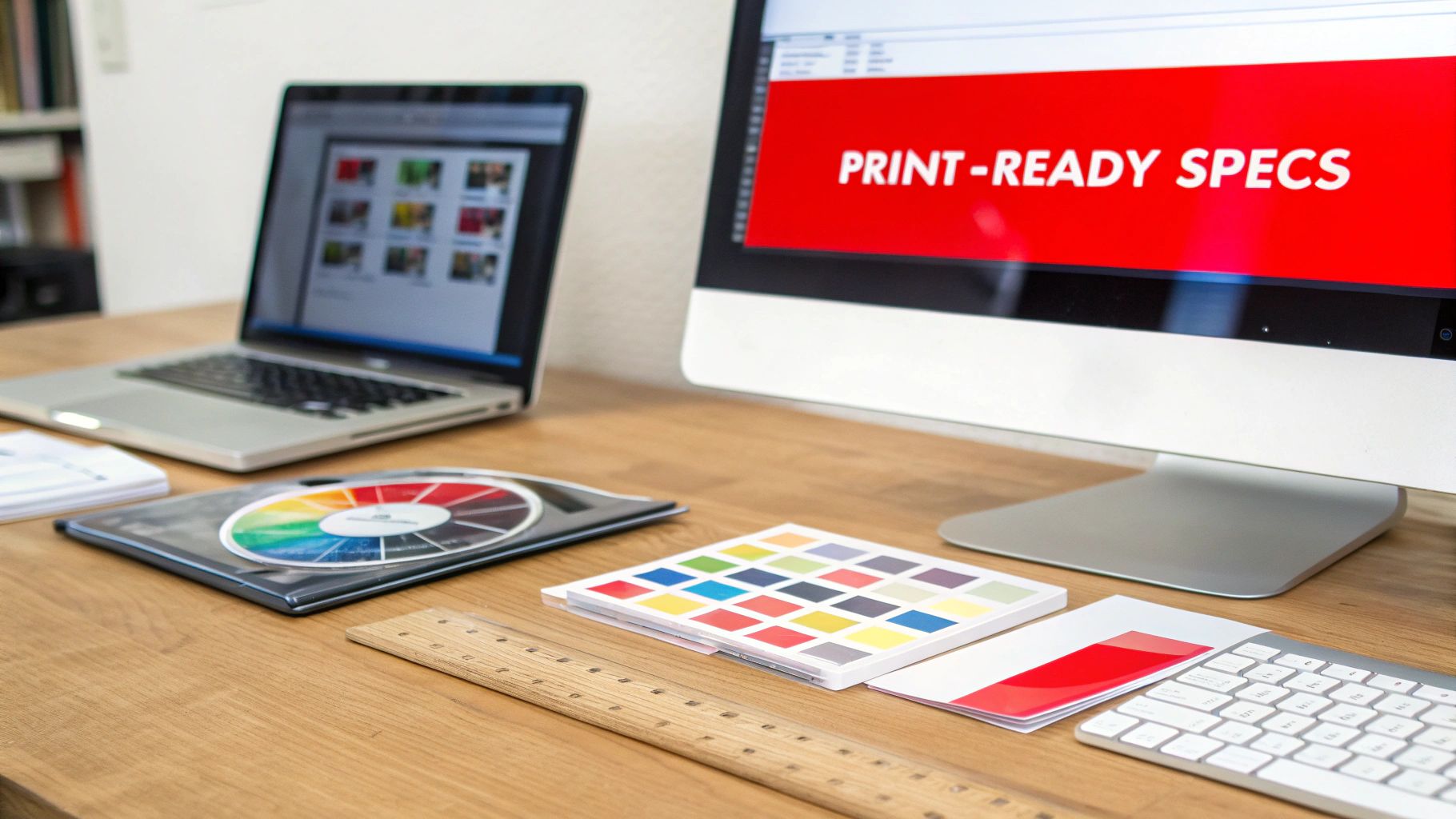
When you work with a professional printer, the single most important thing you can do is prepare your file correctly. They have very specific requirements, and getting them right ensures the final product looks exactly how you imagined. The big three you need to nail are bleed, crop marks, and the color profile.
- Bleed and Crop Marks: We touched on this earlier, but it’s worth repeating. A 0.125-inch bleed on all sides is absolutely essential. When you export your final file, you also need to include crop marks (sometimes called trim marks). These are the tiny little lines in the corners that show the printer exactly where to cut.
- Color Profile: Your file needs to be exported with a CMYK color profile. This is crucial for making sure the colors printed on paper match the colors you approved on your screen. For printers in North America, U.S. Web Coated (SWOP) v2 is a super common and safe choice. You can find this setting in your design software when you’re ready to export.
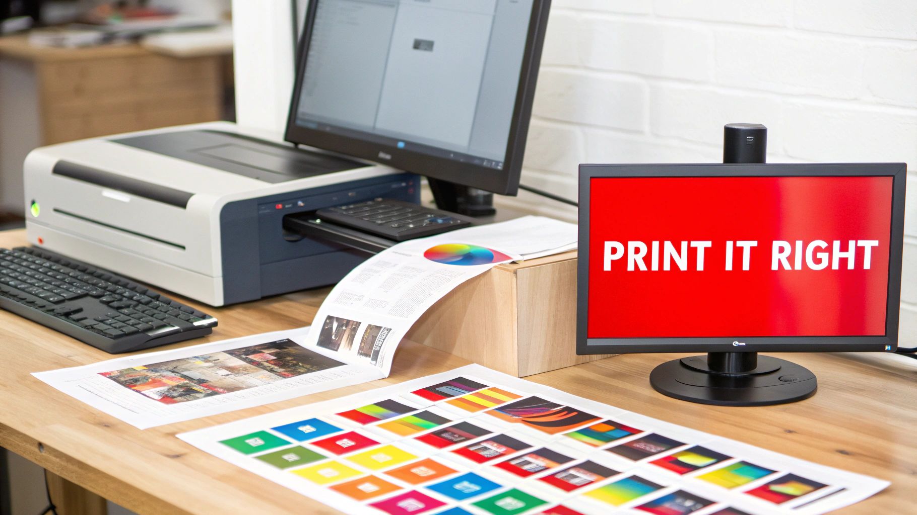
- File Format: The gold standard for submitting print jobs is a high-resolution PDF. When you export from Photoshop or Illustrator, look for a preset called “Press Quality” or “High-Quality Print.” This will make sure your images stay sharp, your fonts get embedded correctly, and your 300 DPI resolution is preserved.
Submitting a perfectly prepped file is the secret to a fast and flawless print run. It shows the printer you know your stuff and helps them bring your vision to life with precision.
DIY vs Professional Printing A Head-to-Head Comparison
Choosing between printing at home and hiring a professional can feel like a big decision. This table breaks down the key differences to help you see which option aligns best with your project’s needs, budget, and timeline.
| Factor | DIY Home Printing | Professional Printing Service |
|---|---|---|
| Best For | Very small batches (1-20 units), prototypes, personal gifts. | Larger runs (25+ units), commercial releases, retail sales. |
| Upfront Cost | Lower. You just need a printer, ink, and quality paper. | Higher. You’re paying for expertise, materials, and equipment. |
| Per-Unit Cost | Can be high due to the cost of ink and special paper. | Decreases significantly as your order quantity increases. |
| Quality & Consistency | Varies. Can be good, but hard to maintain consistency. | Flawless and perfectly consistent across the entire batch. |
| Time & Effort | High. You’re responsible for printing, cutting, and folding. | Low. You just upload the file and wait for delivery. |
| Material Options | Limited to what your home printer can handle. | Huge range of paper stocks, finishes, and special effects. |
Ultimately, the DIY route offers creative freedom and is great for small, personal projects. But if you need reliable, top-tier quality for a larger audience, nothing beats the polish and professionalism of a dedicated printing service.
Common Questions About Making CD Covers
When you’re diving into designing your own CD covers, a few technical questions almost always pop up. Getting these sorted out early will save you a ton of time, money, and frustration down the road.
Let’s be honest, print design can feel a little intimidating at first. But once you get a handle on a few key concepts, you’ll be able to sidestep the most common mistakes people make.
What Resolution Should My Images Be?
This one is non-negotiable. For a sharp, professional result, your design file and every image in it needs to be 300 DPI (dots per inch). This is the gold standard for high-quality printing, period.
Most images you grab from the web are only 72 DPI. They look perfectly fine on a computer screen, but they’ll turn into a blurry, pixelated mess when printed. Before you even start designing, double-check that your document is set to 300 DPI. It’s the single biggest factor in how your final project will look.
Why Is Bleed So Important for My Design?
Think of bleed as a safety net for your artwork. It’s a small extra margin—typically 1/8th of an inch (0.125 inches) on all sides—that extends beyond where the cover will actually be cut.
Commercial printers use massive machines to trim stacks of paper at high speed. They’re incredibly precise, but there’s always a tiny chance of a microscopic shift. By extending your background art into the bleed area, you guarantee that even if the cut is a hair off, you won’t end up with ugly white slivers along the edges.
Forgetting to add bleed is one of the most common and easily preventable mistakes in print design. It’s a simple step that ensures a clean, professional edge on every single copy.
Can I Use Microsoft Word or Google Docs?
While you can technically throw some text and images together in programs like Microsoft Word or Google Docs, please don’t. These word processors are built for office memos and essays, not professional print projects.
They’re missing the essential tools you need to create a print-ready file, including:
- CMYK Color Mode: Word and Docs work in RGB, which is for screens. This will cause major color shifts when printed, leaving your artwork looking dull and disappointing.
- Proper Bleed Management: You simply can’t set up a proper bleed area, which is critical for getting a clean, edge-to-edge print.
- High-Resolution Export: These programs often compress your images and don’t have the robust PDF export settings that printers require.
Using them is a recipe for color problems, low-quality images, and formatting headaches. You’re much better off using a dedicated design tool—even a free one like Canva or GIMP—to ensure your file is prepped for a flawless result.
Ready to turn your design into a stunning physical CD? At CDinsertprints.com make it easy to get professional-
quality printing and duplication, no matter the size of your project.
 www.cdinsertprints.com