How To Create A CD Cover
Create the Perfect CD Cover Printable
A cd cover printable is essentially a digital template you can download, customize with your own art and text, and print out. It’s the perfect final touch that turns a simple burned CD into a thoughtful, fully-packaged gift or a legit-looking demo for your band.
Crafting Your Perfect Mixtape Vision
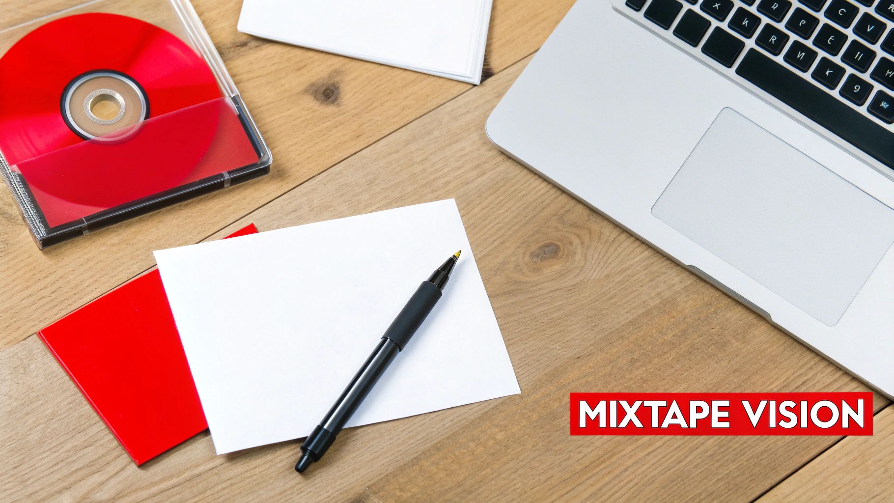
There’s something special about bringing a personalized mixtape or album to life. Designing a custom CD cover isn’t just a craft project; it’s about giving your handpicked playlist a face—a visual identity that matches the sounds tucked inside. It’s what makes your creation feel complete.
Whether you’re piecing together a heartfelt anniversary gift, putting out a demo for your band, or just archiving a perfect road trip playlist, the cover art sets the stage. It’s the first thing someone sees, making the whole experience feel more intentional and memorable.
Your Creative Roadmap
Before you jump into Photoshop or Canva, it really helps to have a game plan. Knowing the path from a simple idea to a finished, printed cover saves a ton of headaches later. The whole process really boils down to a few key stages.
- Brainstorming: First, think about the theme. What’s the vibe of the music? Is it an upbeat 80s mix that needs neon and geometric shapes? A mellow acoustic collection that calls for something more rustic? Let the music itself guide your design ideas.
- Gathering Your Assets: Next, round up everything you’ll need. This means finding high-quality photos, finalizing the tracklist (no typos!), and picking out any specific fonts or color palettes you want to feature.
- Designing and Customizing: This is where the magic happens. You’ll use a template and your design software of choice to arrange all your images and text into a layout that looks killer.
- Printing and Assembling: The final step is bringing it into the real world. You’ll choose the right paper, get your settings dialed in, and print the design that will slide perfectly into a standard jewel case.
To keep things organized, here’s a quick checklist you can follow as you work through your project.
Your CD Cover Project Checklist
| Phase | Main Goal | Essential Tools |
|---|---|---|
| Conceptualization | Define the mixtape’s theme and visual style. | A clear playlist, mood board (Pinterest helps!), sketchbook. |
| Asset Gathering | Collect all necessary images, text, and fonts. | High-res photos, finalized tracklist, font files. |
| Design & Layout | Arrange elements into a cohesive cover design. | Canva, Adobe Photoshop, a good template. |
| Printing & Assembly | Produce a high-quality physical CD insert. | Quality photo paper, a reliable printer, jewel cases. |
Following these phases will help you move smoothly from a rough idea to a polished final product you can be proud of.
A well-designed cover does more than just identify the music; it tells a story. It’s the visual performance of the audio score, turning a simple disc into a complete artistic statement.
And if you’re looking to create something truly professional, from a handful of mixtapes to a full album run, it might be worth exploring services that specialize in high-quality printing. You can find some great options for custom mixtape CD duplication and printing that take care of all the technical stuff for you.
But for the DIY route, this guide will walk you through everything you need to know to get that perfect print at home.
Finding the Right CD Cover Template
Every great CD cover starts with a solid foundation—the template. Think of it as the digital blueprint that guarantees your final design will actually fit into a standard jewel case. I’ve seen people try to wing it, and the results are always a little off. Jumping in without one is a recipe for frustration.
Your goal is to find a high-quality, printable file that sets you up for success from the get-go. The hunt for the perfect cd cover printable will usually lead you to a few different corners of the internet, each with its own pros and cons.
Exploring Your Template Options
The easiest on-ramp for most people is an online design platform. These browser-based tools have become incredibly popular because they handle all the technical stuff for you, letting you focus on the creative side.
On the flip side, if you’re comfortable with professional design software, stock asset websites are a goldmine of high-end, fully customizable options.
Let’s break down the most common sources:
- Online Design Tools (like Canva): These are a beginner’s best friend. They’re packed with thousands of pre-sized, drag-and-drop templates that are super easy to tweak. The only catch? The most popular designs get used a lot, so your cover might not feel entirely unique.
- Stock Photo & Asset Sites (like Adobe Stock): Here you’ll find professionally crafted templates in formats like PSD (Photoshop) or AI (Illustrator). They give you way more creative freedom, but you’ll need the right software and a bit of design know-how to use them.
- Niche Design Marketplaces (like Etsy): This is where you find the really unique, artist-made stuff. I once found the perfect gritty, retro template for a 90s hip-hop mix on Etsy. It had an authentic vibe that a generic template just couldn’t match.
The best template is one that not only looks good but also fits your skill level. A complicated Photoshop file won’t do you any good if you don’t have the software. Start with a tool that feels comfortable.
What Makes a Good CD Cover Printable
Not all templates are created equal. As you’re browsing, you have to look past the flashy design and check the technical specs. A beautiful template with poor specs will give you a blurry, disappointing print every time.
Before you download or buy anything, zero in on these three critical details:
- Correct Dimensions: A standard front insert for a jewel case is 4.724 x 4.724 inches. Your template needs to be sized to these exact measurements. Anything else will require awkward trimming or won’t fit at all.
- High Resolution: This is non-negotiable. For printing, you need 300 DPI (dots per inch). Many templates, especially free ones, are designed for screens at 72 DPI, and they will look pixelated and awful when printed. The template’s description should always state the resolution.
- Usable File Format: Make sure the template comes in a format you can actually open and edit. JPGs are universal but flat, meaning you can’t easily edit individual elements. PSD (Photoshop) or AI (Illustrator) files are layered, giving you full control, but they require the specific software.
For an acoustic playlist I made as a gift recently, I grabbed a clean, minimalist template from Adobe Stock. It was a layered PSD file, which let me easily change the background color to my friend’s favorite shade of blue. It was a small tweak, but it made the final CD feel so much more personal. That’s where a quality template really shines—it gives you the power to make it your own.
Designing a Cover That Looks Professional
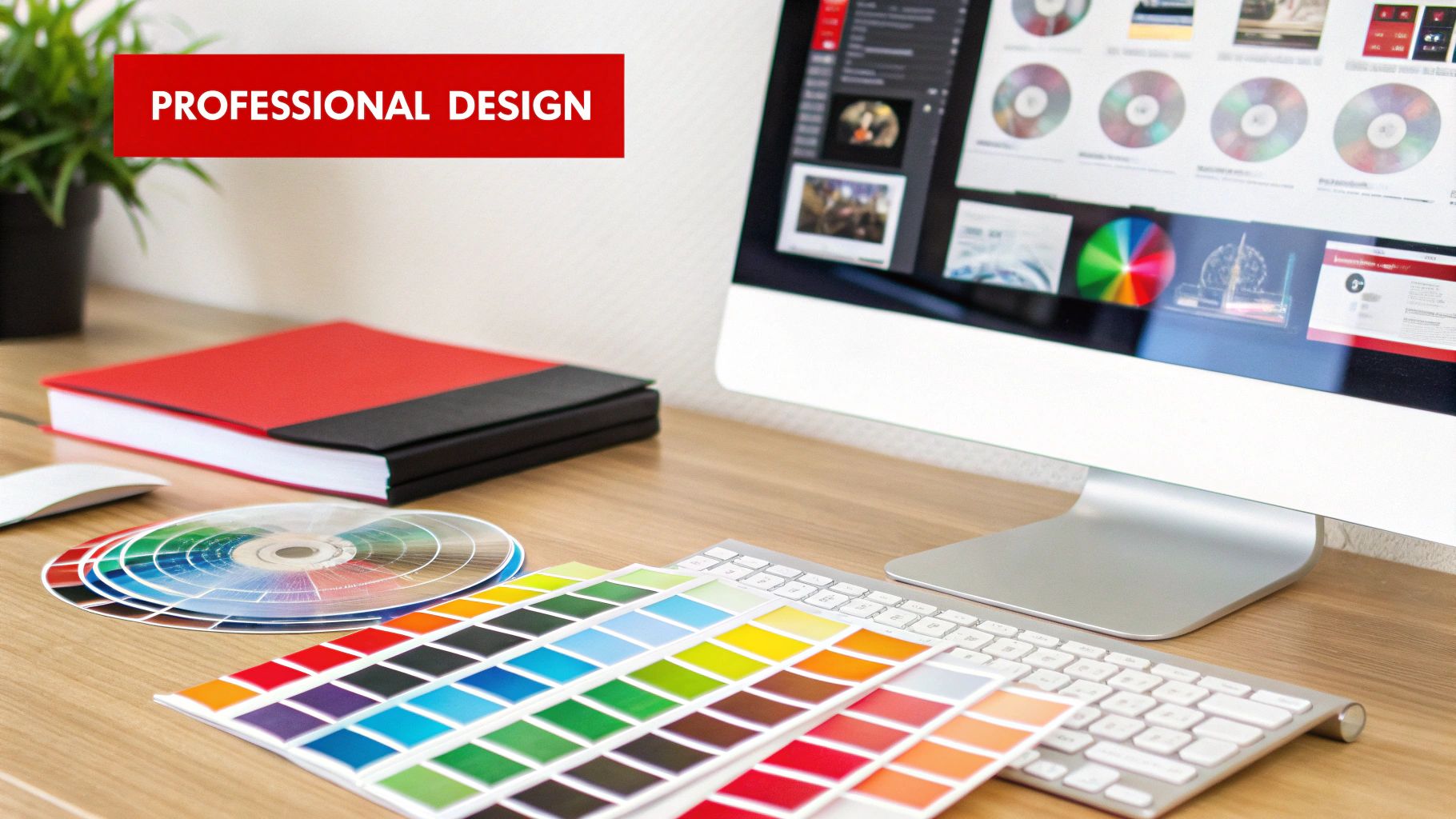
Alright, you’ve got your template. Now for the fun part—making the cover look like you. And don’t worry, you don’t need a graphic design degree to pull off something that feels intentional and polished. The real secret is just focusing on a few core pieces that work together.
The best place to start is with the music itself. What’s the mood of your playlist? Is it a high-energy workout mix? A quiet, melancholic indie collection? Maybe a nostalgic trip back to the ’90s? Let that feeling guide every choice, from the font you pick to the colors on the back. It’s that thematic consistency that separates a great cover from a generic one.
Choosing Fonts and Colors That Match the Vibe
Typography is a surprisingly powerful tool. The right font can instantly signal a mood. Think about the playful curve of a script font for a romantic mix or the bold, clean lines of a sans-serif for a modern electronic playlist.
A good rule of thumb I always follow is to use no more than two fonts. A classic combo is pairing a bold, eye-catching font for the title with a simple, readable font for the artist’s name and the tracklist. A heavy slab serif for the album title and a lightweight sans-serif for the details? That always looks balanced and professional.
Color works the same way. A bright, saturated palette is perfect for a summer pop mix, while muted, earthy tones would feel right at home on an acoustic folk collection.
Pro Tip: If you’re stuck on a color scheme, let a photo do the work. There are free online tools that can pull a color palette directly from an image. It’s a foolproof way to get complementary colors that are guaranteed to look good together.
Arranging Your Images and Text
The layout of your cd cover printable is all about creating balance. You want to arrange everything so the design feels clean and easy to read, not cluttered or chaotic. One of the biggest hurdles is getting text to show up clearly over a busy background image.
Here’s a little trick I use all the time:
- Place your text layer on top of your background photo.
- Add a new layer between the text and the photo.
- Grab a soft, black (or dark-colored) brush, lower the opacity to around 30-40%, and paint a subtle shadow behind the text.
This simple move darkens the area just enough to make your text pop without hiding the image. It’s a tiny detail that makes a huge difference in readability.
The back cover is another place where things can get messy fast, especially the tracklist. To keep it looking sharp:
- Use columns: If you have more than ten songs, splitting the list into two columns is a game-changer.
- Keep it simple: Stick to one, super-readable font for the whole list.
- Align everything: Use your software’s alignment tools to make sure all the track numbers and titles line up perfectly. A clean, aligned list just looks more professional.
For those of you building out the full package, you can find helpful specs for designing various CD cover box elements to ensure the jewel case spine and other inserts fit just right.
Whether you’re using a free tool like Canva or going deeper with software like Photoshop, these principles hold true. Focus on creating a clear visual hierarchy where the most important info—like the mix title—is the first thing people see. By paying attention to font, color, and layout, you can turn a basic template into a unique piece of art.
Why a Physical CD Cover Still Resonates
In a world running on Spotify playlists and instant downloads, you might think a physical CD cover is a relic. But is it? Not even close. A real, tangible cover is what turns a simple playlist into a deeply personal gift, a serious demo for an aspiring artist, or a collector’s item with genuine soul.
It’s the difference between zipping someone a link and handing them a piece of art they can actually hold. As slick as digital music is, it misses that tactile connection. A thoughtfully designed cd cover printable gives the music a visual and emotional anchor that a sterile MP3 file just can’t match.
The Power of a Tangible Gift
Picture this: you’re creating a custom soundtrack for wedding favors or a mixtape for a big anniversary. A personalized cover makes the gesture feel intentional and completely unforgettable. It’s proof that you put real time and creativity into it, turning a simple disc into a keepsake that tells a story.
Or maybe you’re an aspiring musician. Handing a producer a demo CD with a sharp, professional cover is a power move. It screams that you’re serious about your craft. It’s a physical piece of your music that someone can hold onto, which is way more memorable than another email buried in a crowded inbox.
A printed cover bridges the gap between digital and physical, giving your music a real-world presence. It turns abstract sound into a concrete piece of art you can share, display, and treasure.
A Niche That’s Here to Stay
It’s easy to write off the CD as obsolete, but physical media still holds a special place for a dedicated crowd. Sure, CD sales in the United States have cratered by 95% since their peak in 2000, but the global market is still projected to hit $470 million in 2025.
What does that tell us? There’s a stubborn niche of collectors, gift-givers, and die-hard fans who still value the physical format. For a deeper dive, you can check out the latest CD marketing statistics.
This lasting market shows that the ritual of giving and receiving music hasn’t vanished—it’s just become more meaningful. A custom cd cover printable taps right into that feeling. It lets you create something that feels both nostalgic and refreshingly unique. It’s more than just packaging; it’s about crafting a complete experience that honors the music inside.
Printing Your Cover for Flawless Results
Alright, this is the magic moment—turning that design on your screen into something you can actually hold. Getting a crisp, professional-looking print is less about luck and more about a few smart moves before you hit “Print.” The right paper and printer settings are what separate a legit-looking cover from something that screams “I made this on my lunch break.”
Think of the paper you choose as the final ingredient. It completely changes the vibe of your finished project, affecting everything from how the colors look to how it feels in your hand. This decision is a big one for your cd cover printable.
Selecting the Perfect Paper
Your paper choice really sets the personality for your mixtape. Each type brings something different to the table.
- Glossy Photo Paper: This is your go-to if you want that classic, store-bought CD look. The shiny finish makes colors explode off the page and gives photos a super sharp feel. It’s perfect for high-energy mixes or covers with bold, vibrant images.
- Matte Cardstock: If you’re chasing a more artistic, indie, or even a vintage vibe, matte is the answer. Its non-reflective surface gives a softer, more subdued look that works beautifully with illustrations or minimalist designs.
- Semi-Gloss or Luster Paper: Can’t decide? This is a fantastic middle ground. It has a subtle sheen that boosts color saturation without the intense glare of full gloss, making it a versatile option that’s hard to get wrong.
Whatever you land on, make sure it’s got some heft to it. You’ll want to look for a paper weight between 120-150 gsm (grams per square meter). Your standard office paper is just too thin and will end up feeling flimsy and cheap.
This infographic really drives home how a simple playlist evolves into a piece of physical art, making the final print a crucial part of the process.
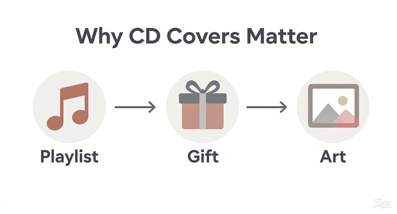
As you can see, the journey doesn’t just stop with the design. That final physical form—the gift, the keepsake—is what completes the whole experience.
Configuring Your Printer Settings
Don’t let your printer’s default settings betray all your hard work. Before you print, you need to dive into the print dialog box and tweak a couple of things.
First, look for a setting called “Media Type” or “Paper Type.” Match this to whatever you’re using, whether it’s “Glossy Photo Paper” or “Matte Cardstock.” This tells the printer exactly how much ink to lay down for that specific paper. It’s a game-changer.
Next, find the “Print Quality” option and crank that sucker all the way up to “High” or “Best.” Sure, it’ll print slower, but the payoff is maximum detail and color accuracy. This small adjustment makes a massive difference in the sharpness of your final cover.
Final Check: Always, always print a test copy on plain old printer paper first. This is your chance to catch any weird alignment issues or colors that look off on paper versus your screen. It’s a five-minute step that can save you from wasting your good, expensive photo paper.
Understanding Margins and Bleed
One of the most common rookie printing mistakes? Getting that frustratingly thin, white border around your beautiful artwork. This usually happens when your design doesn’t account for the printer’s non-printable area, or margins.
The pro solution is a bleed area. A bleed is just a small, extra border of your design that extends past the actual cut lines of the cover. When you trim the cover to size, you slice off this excess, which guarantees your artwork goes right to the very edge. Most good templates will have a bleed area built-in; just make sure your background images or colors fill it completely.
If you ever scale up to more complex projects, it helps to see examples of professional CD duplication packaging to get a feel for how the pros handle it. Follow these simple steps, and your finished CD cover will look just as incredible in your hand as it did on your screen.
Common Questions About CD Cover Printables
When you dive into making your own CD covers, a few questions always pop up. Getting these sorted out from the start will save you a ton of headaches and make sure your project looks great.
Getting the Size Right
One of the first things people ask is about dimensions. Getting this wrong is a classic rookie mistake. For a standard jewel case, your front insert needs to be exactly 4.724 x 4.724 inches (that’s 120mm x 120mm).
The back insert is a little different because it has those flaps for the spine. It should be 5.9 inches wide by 4.6 inches high. No matter what, always set your resolution to 300 DPI. Anything less will look blurry and pixelated when you print.
Picking the Right Paper and Tools
What kind of paper should you use? That’s another big one. If you want that slick, store-bought look with deep, rich colors, go for a medium-weight glossy or semi-gloss photo paper. It just makes the artwork pop.
For a more indie, artistic vibe without the shine, a smooth matte cardstock is a fantastic choice. The one thing to avoid is regular office paper—it’s way too thin, and your colors will end up looking washed out and sad.
A lot of people also worry they need expensive design software. Good news: you don’t. Easy-to-use tools like Canva are perfect for creating a custom cd cover printable. They have tons of templates you can just drag and drop your art into, right in your browser.
The concept of a ‘CD cover’ has evolved rather than disappeared. Even in the digital era, the visual art accompanying music is more important than ever for creating a complete artistic statement.
This is truer than ever. Album art isn’t just for physical copies anymore; it’s a huge part of an artist’s brand online. A 2025 survey even found that 60% of independent artists are now commissioning original digital art for their releases, even if they’re only streaming. You can read more about the enduring importance of album cover art and see how it’s still making a huge impact.
Ready to create a mixtape that looks as good as it sounds, without the DIY hassle? At Mixtape Duplication, we turn your playlist into a professionally crafted CD with a custom cover. Send us your songs, and we’ll handle the rest. Create your custom mix CD today!