How To Print a CD cover
A Guide to Printing CD Covers That Look Pro
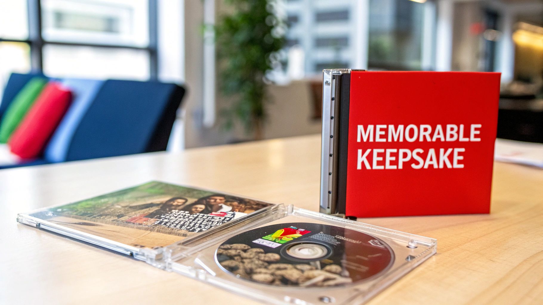
Printing a physical CD cover does more than just protect a disc; it transforms it into a memorable keepsake, a professional portfolio, or a polished product. It’s your chance to forge a tangible connection that digital files simply can’t match, turning your project into something that leaves a lasting impression.
Why a Custom CD Cover Still Makes an Impact
In a world running on streams and downloads, the idea of printing a CD cover might feel a bit old-school. But its impact is actually more significant than ever. Think of a physical cover as the visual handshake for your project, whether it’s a music album, a software package, or even a wedding favor. It instantly adds a layer of professionalism that a blank disc just can’t compete with.
This tangible format creates a much stronger bond with whoever receives it. For an indie musician, it’s a piece of merch that fans can hold, display, and cherish. For a business, it’s a professional leave-behind that keeps your brand top-of-mind long after a meeting is over.
The demand for physical media in certain markets is still surprisingly strong. The global CD printing equipment market was valued at USD 1.2 billion in 2023 and is actually projected to grow. This trend highlights a continued appreciation for high-quality, physical products. You can find more insights about CD printing market trends that back this up.
A thoughtfully designed CD cover does more than just protect the disc; it tells a story, sets a tone, and makes your content feel substantial and valuable before anyone even presses play.
Ultimately, a custom cover serves a few key purposes:
- Elevates Your Brand: It’s a canvas for your logo, color scheme, and unique artistic style.
- Enhances the Experience: It gives you space for liner notes, tracklists, or important instructions.
- Boosts Value: A professional package can justify a higher price point for any commercial project.
Designing Your Cover for Flawless Printing
A professional print job starts way before ink hits the paper. The secret to a great-looking CD cover is a properly prepared design file. Getting this initial setup right ensures what you see on your screen is exactly what you get in your hands.
Your choice of design software matters here. Pro tools like Adobe Photoshop give you granular control over every technical detail, from color modes to print margins. On the other hand, free alternatives like Canva have become surprisingly powerful, offering user-friendly templates to get you started fast. Just make sure whatever you use can export a print-ready file with the right specs.
Master the Technical Essentials
To sidestep common printing headaches, you need to nail three non-negotiable settings.
First up is the color mode. Your computer screen uses an RGB (Red, Green, Blue) profile, but professional printers run on CMYK (Cyan, Magenta, Yellow, Black). If you design in RGB and convert it later, you’re in for a nasty surprise with dull, shifted colors. Always start your project in CMYK from the beginning.
Next is resolution, measured in DPI (Dots Per Inch). For sharp, clear images and text, your design file must be 300 DPI. Using a lower resolution, like the 72 DPI standard for web images, will give you a blurry, pixelated cover that just screams amateur.
Setting up your file with the correct bleed and safe zones is the single best way to protect your design. It’s the difference between a perfectly centered cover and one with text awkwardly cut off at the edge.
Understanding Bleed and Safe Zones
Finally, you have to account for the physical cutting process by setting up proper margins. This is where bleed and safe zones come in.
- Bleed: This is an extra border—usually 1/8th of an inch (3mm)—that extends your background color or image beyond the final trim line. It’s a safety net that prevents ugly white edges if the cutting machine is off by just a hair.
- Safe Zone: Think of this as an inner margin where you keep all the important stuff, like text and logos. Anything inside this area is guaranteed not to get trimmed off during production.
For example, forgetting to add bleed when printing jewel case inserts often leaves a frustrating white sliver along one side of your artwork. For specific templates and layouts, you can find great resources from services like Mixtape Duplication.
Getting these details right from the start will save you a ton of time, money, and the pain of having to order a reprint.
Getting The Technical Specifications Right
This is where a great DIY project can hit a snag. To make sure your CD cover looks like it came from a professional press and not a home office, getting the technical specs perfect before you print is non-negotiable. It’s all about the details—dimensions, file formats, and print quality.
Getting the size wrong is one of the most common—and frustrating—mistakes. Every type of CD case has slightly different measurements. A standard jewel case, for example, needs a front booklet with completely different dimensions than its back tray card, which also has to be scored perfectly for the spines. Mess that up, and you’re reprinting the whole batch.
You can find helpful visual guides online that break down the exact dimensions for different CD packaging options to avoid sizing errors. When in doubt, always start with a reliable template.
Nail The Dimensions From The Start
Before you even open your design software, you need to know the final dimensions. Here’s a quick-reference table for the most common CD case types. Getting these numbers right is the first step to a perfect print.
| CD Case Type | Front Cover Insert (Width x Height) | Back Tray Insert (Width x Height) | Recommended Bleed |
|---|---|---|---|
| Standard Jewel Case | 4.75″ x 4.75″ | 5.9″ x 4.625″ | 0.125″ (1/8″) |
| Slim Jewel Case | 4.75″ x 4.75″ | 5.4″ x 4.625″ | 0.125″ (1/8″) |
| Cardboard Sleeve | 4.9″ x 4.9″ | N/A | 0.125″ (1/8″) |
| Digipak (4-Panel) | 4.75″ x 4.75″ (per panel) | 4.75″ x 4.75″ (per panel) | 0.125″ (1/8″) |
Always remember to add a 0.125-inch bleed on all sides. This extra margin ensures your artwork extends to the edge of the paper, so you don’t end up with ugly white borders after trimming.
Choose The Right File Format
The file format you save your design in can either make or break the final print quality. A JPEG might look fine on your screen, but it’s a “lossy” format, meaning it sheds data every time you save it. That can lead to fuzzy text and pixelated images on the printed cover.
For printing, you need a format that keeps every single detail sharp.
- PDF (Portable Document Format): This is the gold standard for a reason. PDFs lock in your fonts, images, and layout, so what you see on your monitor is exactly what comes out of the printer. It’s the top choice for any professional print service.
- TIFF (Tagged Image File Format): A TIFF is a “lossless” format, so no image quality is lost during saves. This makes it perfect for high-resolution photos or intricate artwork where you need maximum clarity.
- JPEG (Joint Photographic Experts Group): Only use a high-quality JPEG if you have no other option. If you must, make sure to export it at the highest possible setting (100% quality or 12) to keep compression artifacts from ruining your design.
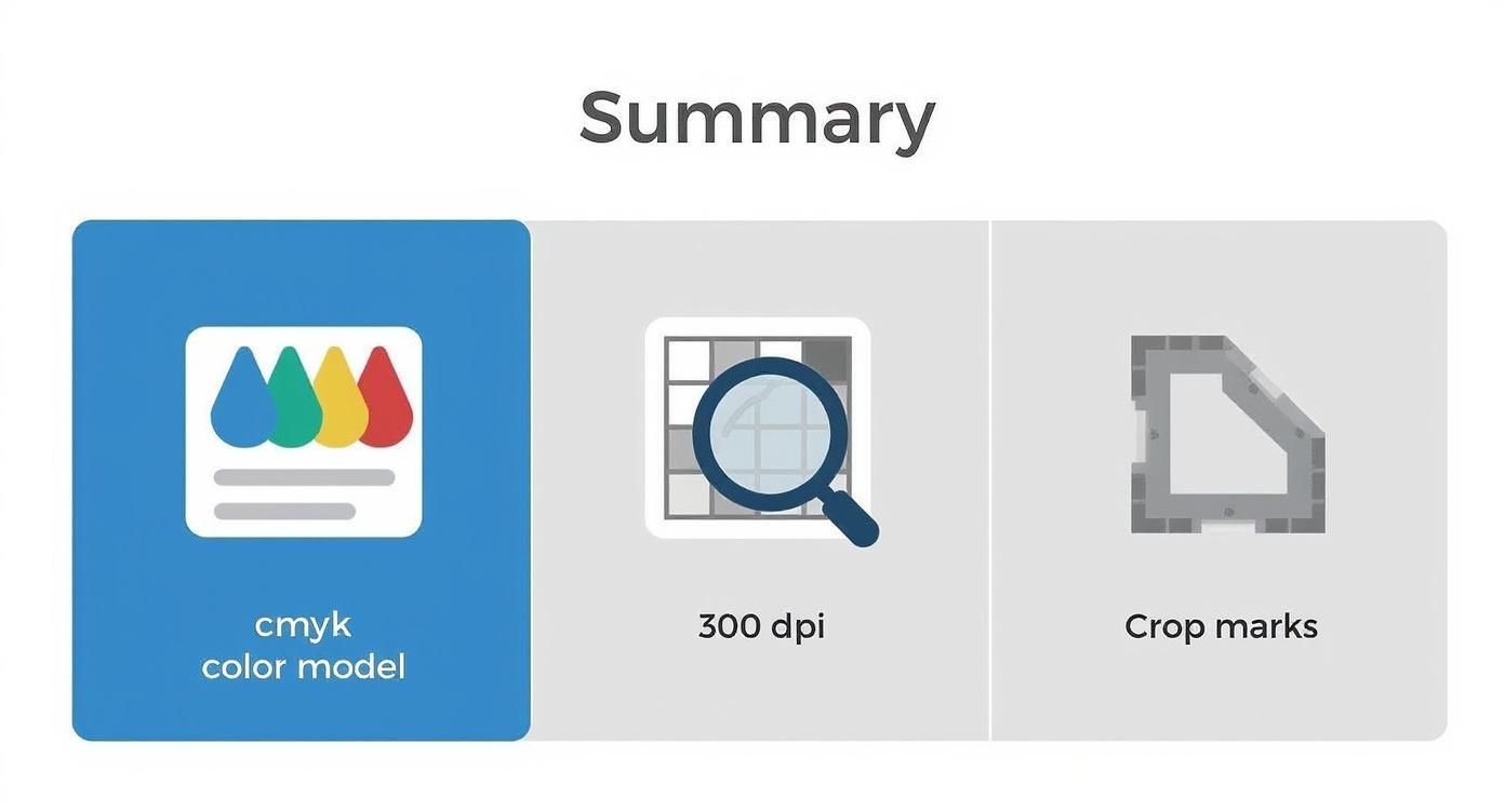
To get a truly professional result, you have to master these three things: CMYK color mode, a resolution of 300 DPI, and a proper bleed setup. There’s no way around it.
For home printing, a high-resolution PDF will give you the most reliable results. If you’re sending your files to a professional service, they’ll almost always demand a print-ready PDF. It prevents any surprises or formatting shifts on their end.
Picking the right format is a simple choice that protects your hard work. It ensures your design looks just as crisp and vibrant on paper as it did on your screen.
Choosing the Right Paper and Printer
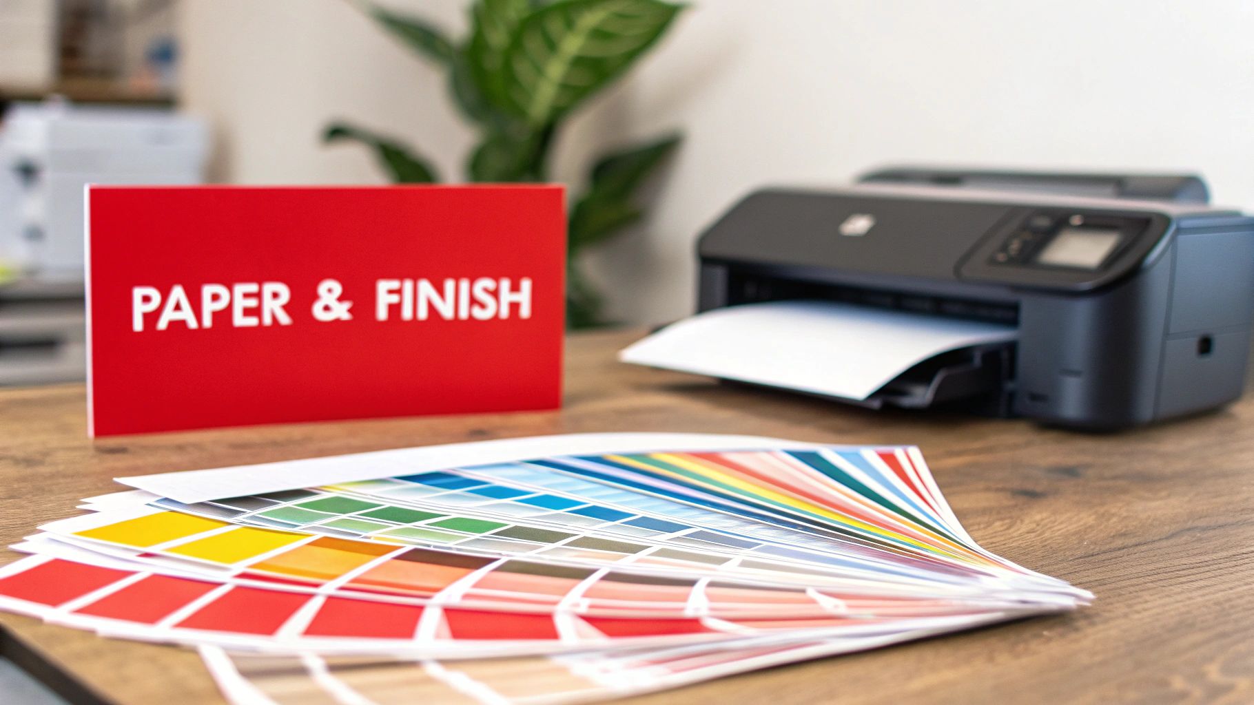
The materials you print on are just as important as the design itself. Getting the paper and printer right can take your project from a simple DIY job to something that feels professional and solid in your hands. These choices directly impact the final look, feel, and even how long your CD cover will last.
Think about the vibe you’re going for. A high-gloss photo paper will make your colors explode, giving your cover a modern, commercial sheen that’s perfect for pop music or dynamic photography. But if you’re a singer-songwriter or want a more classic, artistic texture, a matte or satin-finish cardstock is the way to go.
Selecting Your Paper Stock
One of the most crucial factors is paper weight, measured in GSM (Grams per Square Meter). Standard office paper is a flimsy 80 GSM—definitely not what you want for a quality cover. You need to aim for something much more substantial.
- 120-150 GSM: This is a great starting point for booklets and multi-page inserts. It’s thick enough to feel professional but still flexible enough to fold without cracking.
- 200-300 GSM: This heavier cardstock is perfect for single-panel inserts or sturdy sleeves. It provides the rigidity and durability needed to stand up to handling.
Heavier stock doesn’t just last longer; it boosts the perceived value of your entire project. A flimsy insert can make an otherwise amazing design feel cheap.
Your choice of paper finish—glossy, satin, or matte—is a creative one. Glossy makes colors punchy, while matte offers a sophisticated, non-reflective look that won’t show fingerprints.
Home Printing Versus Professional Services
For small batches, a decent home inkjet printer can deliver fantastic results, especially when you use high-quality photo paper. Inkjets are brilliant at blending colors smoothly, making them a great fit for photographic designs. Just remember to set your printer to its highest quality setting and choose the correct paper type in the print menu.
But if you’re printing a larger run or need absolute consistency across every single copy, a professional printing service is your best bet. They generally offer two options:
- Digital Printing: This is ideal for short runs (under 500 units). It’s fast and cost-effective for smaller quantities, making it the go-to for most independent projects.
- Offset Printing: The traditional choice for massive projects, offset printing delivers unbeatable quality and a lower price per unit for runs in the thousands, but the initial setup costs are higher.
The printing industry is still a huge market, and the rise of digital tech has fueled the demand for custom work like CD covers. This shift also includes a move toward greener options like water-based inks and recycled paper. You can dig into the latest printing industry statistics to see where things are headed. Ultimately, your decision will come down to your budget, how many copies you need, and the level of quality you’re aiming for.
Putting It All Together for a Pro Look
Alright, you’ve got your designs printed and ready to go. This next part is where flat pieces of paper transform into something that looks like it came straight from a record store. The key is in the assembly.
First things first: getting clean, straight cuts. Forget scissors—they’re a recipe for wavy edges. A simple craft knife paired with a metal ruler gives you the kind of precision that makes all the difference.
When it comes to back tray inserts with spines, the fold is everything. Don’t just wing it and fold the paper by hand, or you’ll end up with a buckled, unprofessional mess. The trick is to score the fold lines first. Grab a ruler and run the dull side of a butter knife or an empty ballpoint pen along the line. This creates the perfect crease, so your insert folds cleanly and slides right into the jewel case without any fuss.
Adding That Polished Finish
If you’re aiming for that retail-quality feel, the final finish can elevate your project from good to great. When you use a professional printing service, you’ll usually get a few options for coatings. These don’t just protect the ink; they give your artwork a premium look and feel.
- UV Gloss Coating: This is your go-to for a high-shine, reflective finish. It makes colors pop and adds a durable layer that guards against minor scuffs.
- Matte Laminate: For a more artistic, subdued vibe, a matte finish offers a soft, non-reflective surface that just feels sophisticated to the touch.
A professional finish does more than just look good—it adds serious durability. A simple gloss coat can protect your artwork from fingerprints and even minor moisture, making sure your project stays looking sharp for years.
These final touches are what separate a decent DIY job from something truly professional. To get a better idea of how different inserts and boxes come together, take a look at these examples of completed CD packaging.
Common Questions About Printing CD Covers
Jumping into printing your own CD covers always kicks up a few questions. I’ve seen it time and time again. Getting a handle on the basics from the start will save you from common headaches and make sure your final product looks slick and professional.
Print At Home Or Use A Service?
One of the first things people ask is if their home printer is good enough. For small batches, a decent inkjet printer can absolutely get the job done. The trick is to use the right paper—think glossy photo paper or a thin cardstock—and crank up the print settings to the highest quality.
But if you’re doing a larger run or need perfect color matching across every single cover, a professional service is the way to go. It’s just more reliable.
A huge stumbling block is resolution. To get that truly professional, sharp look, your artwork has to be 300 DPI (dots per inch). This is the non-negotiable standard for print. It ensures your text and images are crisp, not blurry like they would be if you used a 72 DPI file meant for a screen.
Here’s a pro tip I always give: Design in CMYK color mode, not RGB. Your screen shows colors in RGB, but printers use CMYK. If you design in the wrong mode, you’ll get noticeable color shifts, and your vibrant design will come out looking disappointingly dull.
Finally, let’s talk about “bleed.” This is a term that trips people up, but it’s simple. Bleed is a small safety margin, usually 1/8th of an inch, that you add to your design beyond the actual cut line. It’s there to prevent any ugly white edges if the cutting machine is off by a tiny fraction. It guarantees a clean, edge-to-edge finish every time.
Ready to bring your perfect playlist to life with a professionally printed cover? Let Mixtape Duplication handle the details. Create your custom mix CD today!